
- Global
- 2025.10.01
Behind the Scenes:How Paint Technology Brings Kintetsu HINOTORI Limited Express to Life
SHARE


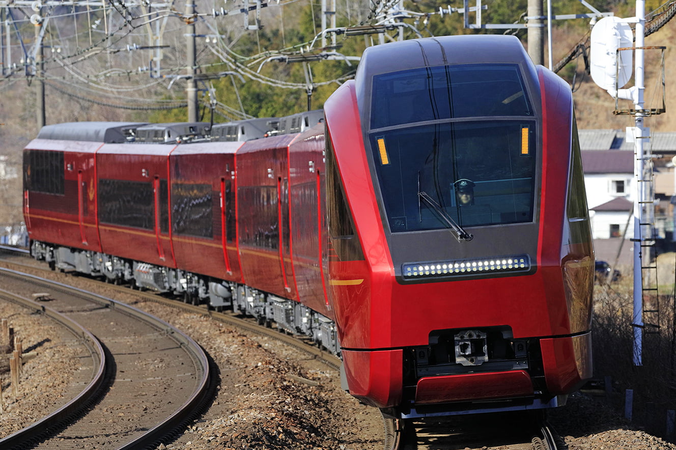
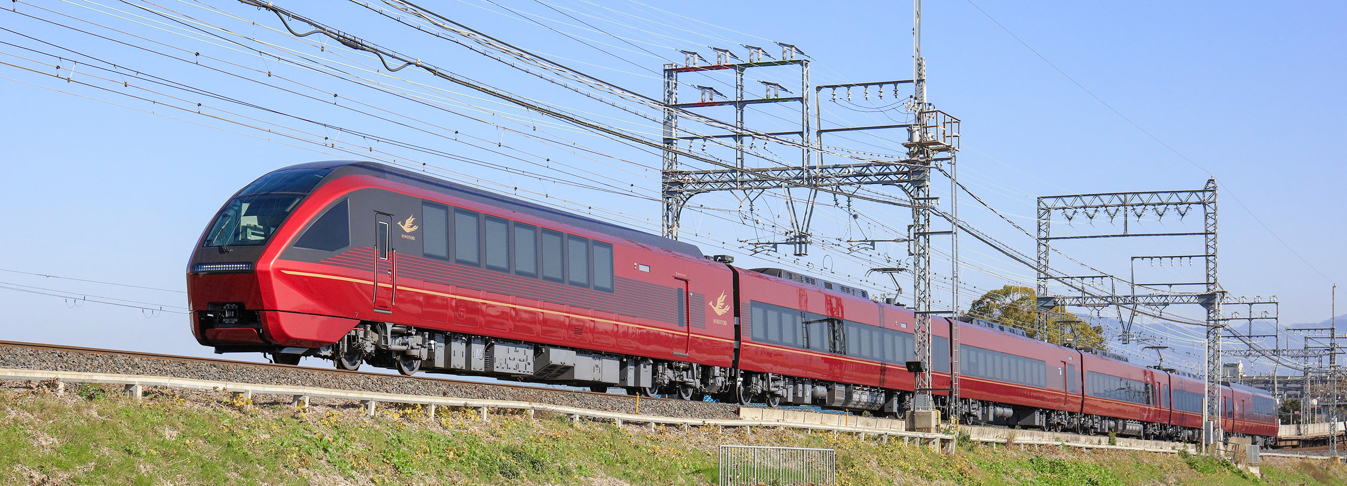
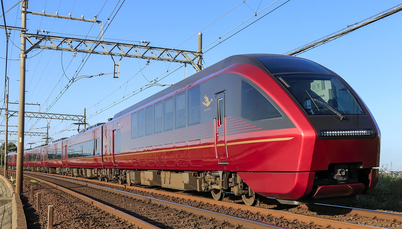
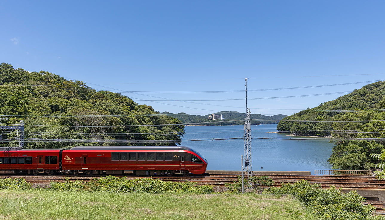
The Kintetsu “HINOTORI” Limited Express, connecting Osaka-Namba and Kintetsu-Nagoya, is instantly recognizable by its striking metallic red exterior, radiating a deep, lustrous sheen. Its name, HINOTORI (Phoenix), was chosen to symbolize refined elegance, offering spacious comfort and first-class service, much like the majestic phoenix soaring with wings outstretched. At the heart of its distinguished identity lies “HINOTORI Red,” a specially engineered railway paint born from cutting-edge technology and uncompromising dedication to quality. We spoke with the development team to uncover the story behind its creation, the challenges overcome, the expertise applied, and the vision required to craft a finish that embodies both the spirit of Kintetsu’s iconic express and its forward-looking design.
Enhancing Aesthetics, Ensuring Durability: The Twin Functions of Railway Vehicle Paint
Paint plays a vital role not only in giving railway vehicles their striking colors and brilliant sheen, but also in shielding them from the demanding realities of daily operation. Railway vehicle paints must endure powerful vibrations at high speeds and the pressure shockwaves of trains passing in tunnels. Beyond these mechanical stresses, the paint must also resist dirt and contamination while withstanding the extremes of seasonal change, from the heat and humidity of summer to the bitter cold of winter. Our goal was to create a paint that achieves both, striking aesthetics and long-lasting protection, designed to withstand the rigorous demands of today’s railway vehicles.
Creating a “New Red” for Innovative Railway Vehicles
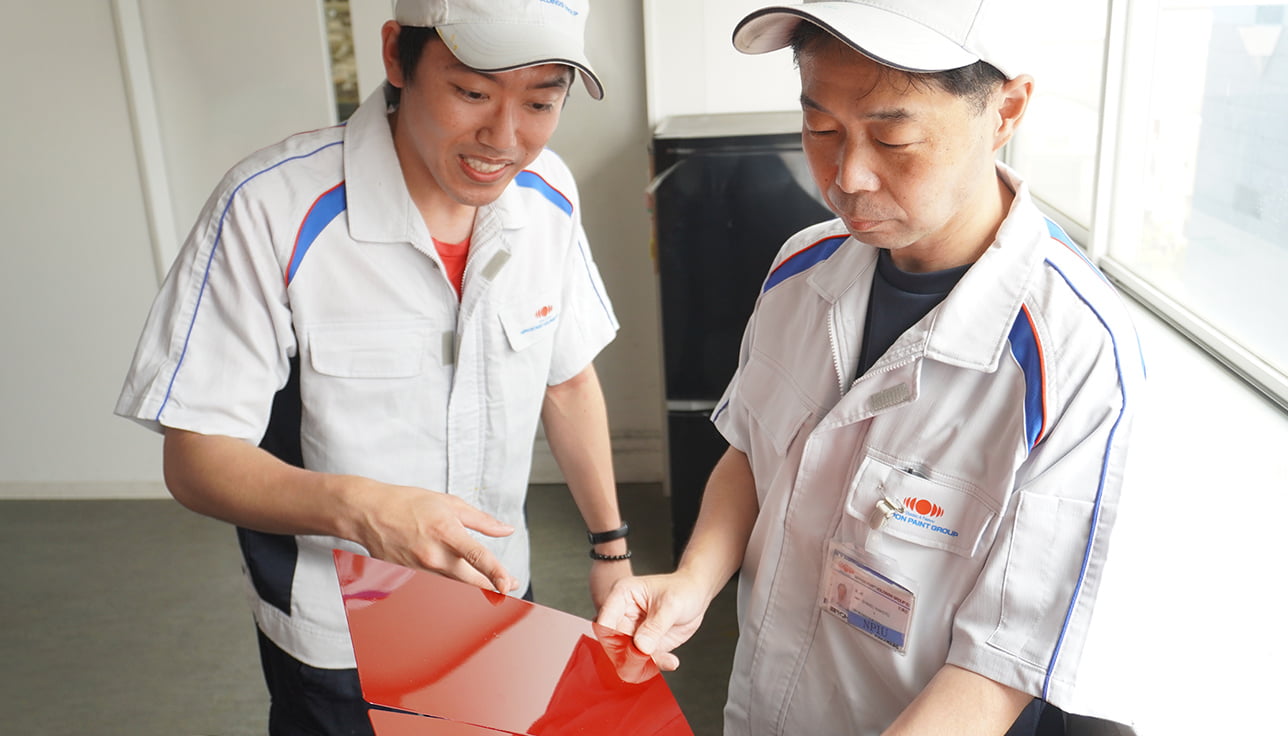
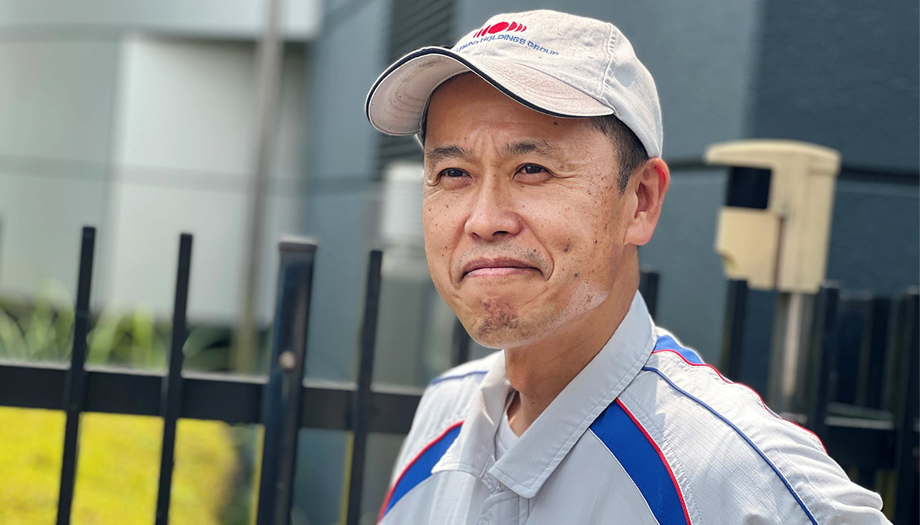
The journey to develop the paint for Kintetsu’s HINOTORI Limited Express began in November 2017.Looking back, one development team member recalls: “The designer requested a metallic red with an intensity and brightness never before seen, a truly unprecedented shade.” Our mission was clear: to create a red so vivid it would become the most striking color ever applied to a Japanese railway vehicle. Yet achieving this goal proved anything but simple. Traditional pigment blending failed to deliver the required vibrancy. Metallic paints typically rely on a gray base, and merely adding red pigment produces a dull, muted result. Because the client specifically asked for a “clear red,” we approached the color formulation with painstaking care, ensuring every step preserved maximum chromatic purity. Of course, achieving the desired color was only half the challenge. The paint also needed to deliver outstanding protective performance, capable of withstanding the rigors of railway operation. “At first, creating a tone never before used on railway vehicles seemed an enormous hurdle,” one team member reflects. “Yet by drawing on our know-how from automotive coatings and working hand in hand with our technical specialists, we were able to identify the right materials and engineer practical solutions. This collaborative process ultimately paved the way for the breakthrough we sought.”
Identifying the Optimal Formulation from Tens of Thousands of Combinations
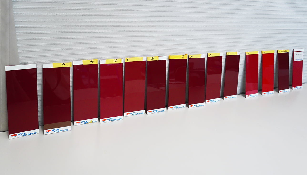
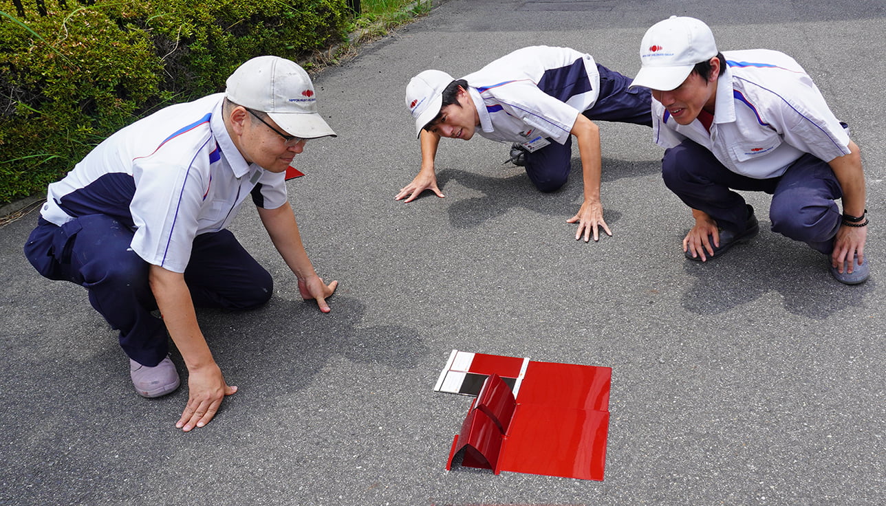
Although our objective was to create an entirely new shade of red, development for railway coatings always begins with materials that already have a proven track record. Railway paints must comply with stringent safety and performance standards, and introducing completely new materials can be time-consuming due to the certification process. One team member recalls: “We tried to imagine the kind of color each combination might produce, even experimenting with materials we would not normally consider. For red pigments alone, there are nearly 20 options; for blue, more than 10; and for metallic effects, around 20 types. Taken together, the possible combinations reach into the tens of thousands.”The initial formulations were applied to flat panels, but judging subtle shifts in tone on a flat surface proved difficult. To capture the nuances more accurately, the team coated three-dimensional, ridge-shaped samples, and later confirmed promising shades by testing them on larger surfaces.Through this painstaking, iterative process, we identified the optimal formulation, one that not only achieved the vivid new red we envisioned but also delivered the durability and protective performance essential for railway applications.
Bringing Customers’ Color Visions to Life
Customers often express their wishes in broad, abstract terms, “We want a memorable color,” or “We want a luxurious color.” It then falls to the designer to translate these impressions into tangible directions for the development and technical teams. In many ways, the process is like transforming an imagined color into both language and material form. While the requests may be qualitative, achieving them ultimately depends on rigorous quantitative analysis and technical expertise.Clear communication is vital, ensuring that every color choice is tied to a specific purpose and effect. As one development team member explains: “Creating colors for railway vehicles is uniquely challenging because the scenery is constantly changing as the train moves. We have to consider how the color will harmonize or contrast with forests, skies, and cityscapes along the route.”Equally important is the passenger perspective. “Because this is a special train, we focused on developing a color that would be instantly recognizable and memorable, even in photos shared on social media,” the team member continues. Step by step, through careful refinement and adjustment, the color was shaped until it faithfully reflected the customer’s original vision.
Striking the Perfect Balance Between Aesthetic Appeal and Application Efficiency
Whereas standard commuter trains are usually finished in simple, monotone colors, the past decade has seen growing use of metallic finishes, particularly on luxury and sightseeing trains, as a way to create distinctive brand identities that captivate passengers. “With solid colors, the process is relatively straightforward,” one development team member explains. “But metallic paints contain sparkling particles that shift in appearance depending on the viewing angle. That means we have to make precise adjustments to ensure the color is perceived consistently from every perspective.”Metallic coatings also bring technical challenges not present in solid finishes. “A single application of solid paint generally produces a film thickness of 20–30 μm (1 μm = 1/1000 mm). Metallic paints, however, must be applied much more delicately, around 7–8 μm per coat, repeated multiple times with absolute uniformity. This is because they contain flat aluminum flakes, and the final appearance depends on achieving even, controlled reflection,” the team member continues.On top of that, metallic finishes require a protective clear coat to preserve both brilliance and durability. “The real challenge,” the team member notes, “is striking the right balance, minimizing the number of coats while still delivering the aesthetic appeal and long-term performance demanded of premium trains.”After extensive trials and fine adjustments, the team ultimately presented a total of 16 distinct shades of red, each carefully selected to meet the highest standards of appearance and function.
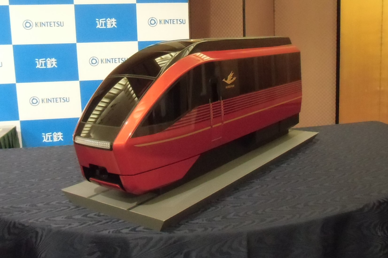
Final Presentation with Railway Vehicle Model Demonstration
Through repeated trials and refinements, we gradually shaped the image of the ideal color. Yet a significant challenge soon emerged. Because the HINOTORI Limited Express operates between Osaka-Namba and Kintetsu-Nagoya, both terminal stations located underground, there was concern that the chosen red might appear darker than intended without the benefit of natural sunlight.To resolve this, the formulation was carefully adjusted to prevent dullness, brightening the shade while still preserving the integrity of the red tone. Even so, a final decision was difficult to reach, prompting the team to explore solid colors as an alternative.One development team member recalls: “Throughout our discussions, it was clear the vehicle designer was deeply committed to a richly saturated metallic red. Determined to realize this vision, we selected a colored aluminum pigment capable of maintaining its brilliance even in environments without natural light. This ensured the aesthetic appeal would remain consistent, whether seen indoors or outdoors.”For the final presentation, a railway vehicle model was prepared with one side coated in metallic red and the other in solid red, enabling the customer to directly compare the visual impact under outdoor lighting.
The Birth of “HINOTORI Red”: A Vivid Metallic Shade Sparkling in Sunlight
The long-awaited final presentation arrived, but the weather threatened to spoil the occasion. “I was worried we wouldn’t be able to demonstrate the true difference in color without sunlight,” recalls one sales representative.Then, as if on cue, the rain eased and sunlight broke through the clouds, revealing just how striking the contrast between the metallic and solid colors in natural light. “At last, I feel my vision has come to life,” the vehicle designer exclaimed with joy, an unforgettable moment for the entire team. The final decision was made in March 2019. Thus, “HINOTORI Red” was born: a highly saturated metallic red designed to shine brilliantly in sunlight. One development team member reflects: “My role is not to pursue the colors I personally want, but to bring to life the colors envisioned by our customers. At times, paints that are more complex to manufacture may place additional burdens on them. While that is never our intent, it remains essential to deliver the exact shade they seek. That’s why I make it a priority to explain both the advantages and challenges, whether in terms of color reproduction or production complexity, so customers can make confident, informed choices.” Today, the HINOTORI Limited Express continues its journey, carrying with it not only passengers, but also the dedication and passion of the development team, professionals committed each day to transforming vision into reality.
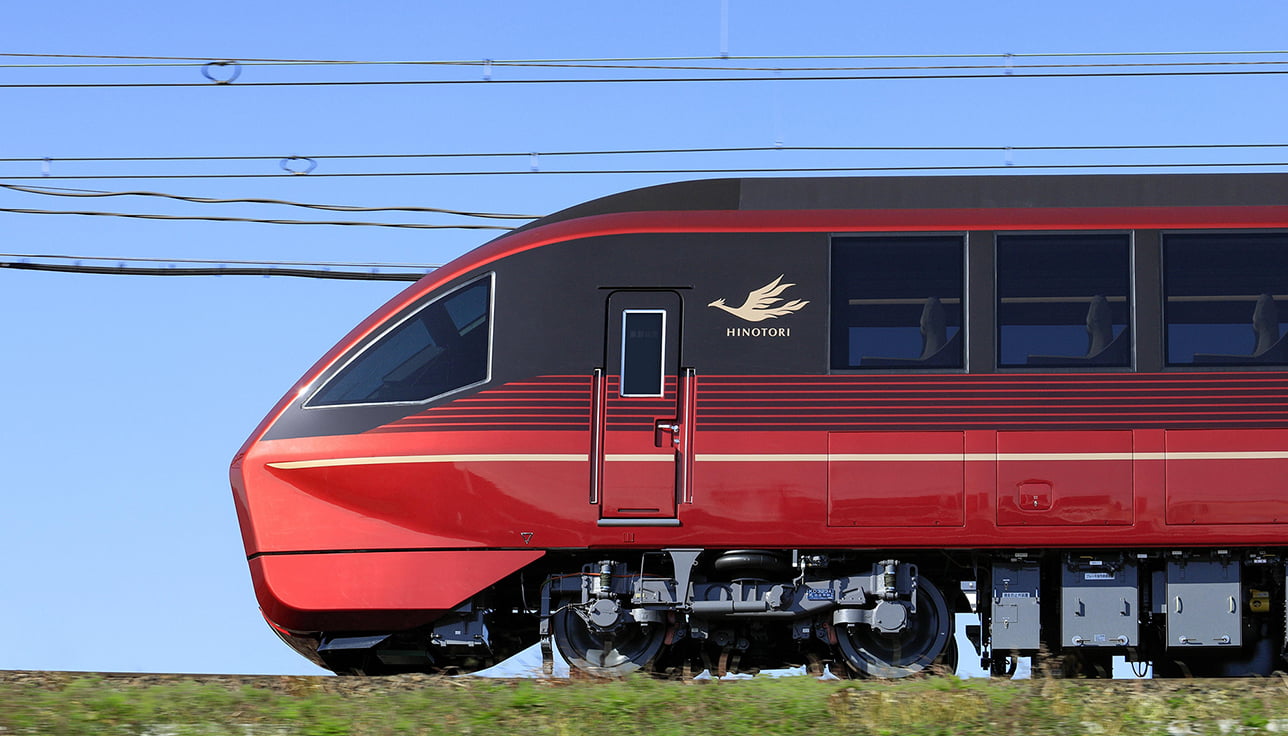
We extend our heartfelt gratitude to everyone who contributed to the development of the paint for the HINOTORI Limited Express, linking Osaka and Nagoya, and who rose to the challenge of meeting numerous demanding requirements throughout the process. For this vehicle development, we settled on the exterior design, aiming to embody both speed and innovation, qualities worthy of the Nagoya-Osaka limited express. Its body, finished in a rich, lustrous metallic red, conveys a perfect balance of strength and refinement. The dynamic play of light and shadow, the subtle color transitions created along the distinctive “edge line” of the train’s iconic front end, and the seamless harmony with the gold logo and accent lines together bring to life an express train of exceptional elegance. This achievement was made possible only through the dedication, expertise, and close collaboration of the entire development team, for which we are sincerely grateful.