SHARE


Surrounding colors are reflected in white
- this has led him to select gray
Today, I often select gray paint for interior walls in the spaces that I have designed. I used to use white a lot, but not so much now. One reason is that after using white many times, I began to feel that it was inconvenient because there were only a few options: pure white, grayish white, and a color midway between them. In addition, if painted white, the wall reflects the color of the floor in the daytime and that of lighting in the evening. I came to feel it was not beautiful, which is another reason. So, I wondered if I could use other colors, and from four to five years ago, I began to try adding yellow or green to white as well as using gray and beige.
Gray, not affected by the colors of other items
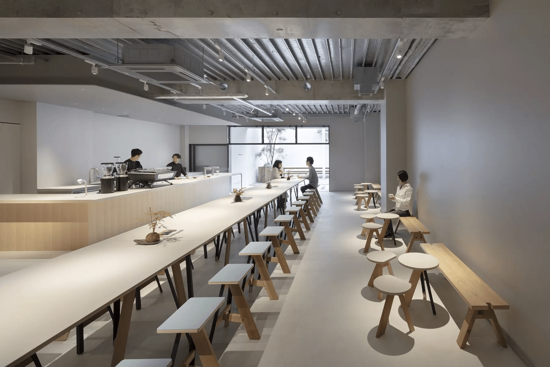
Today I often use gray, and this approach began when I designed “dotcom space Tokyo” (“dotcom”), a cafe and event space opened in 2019.
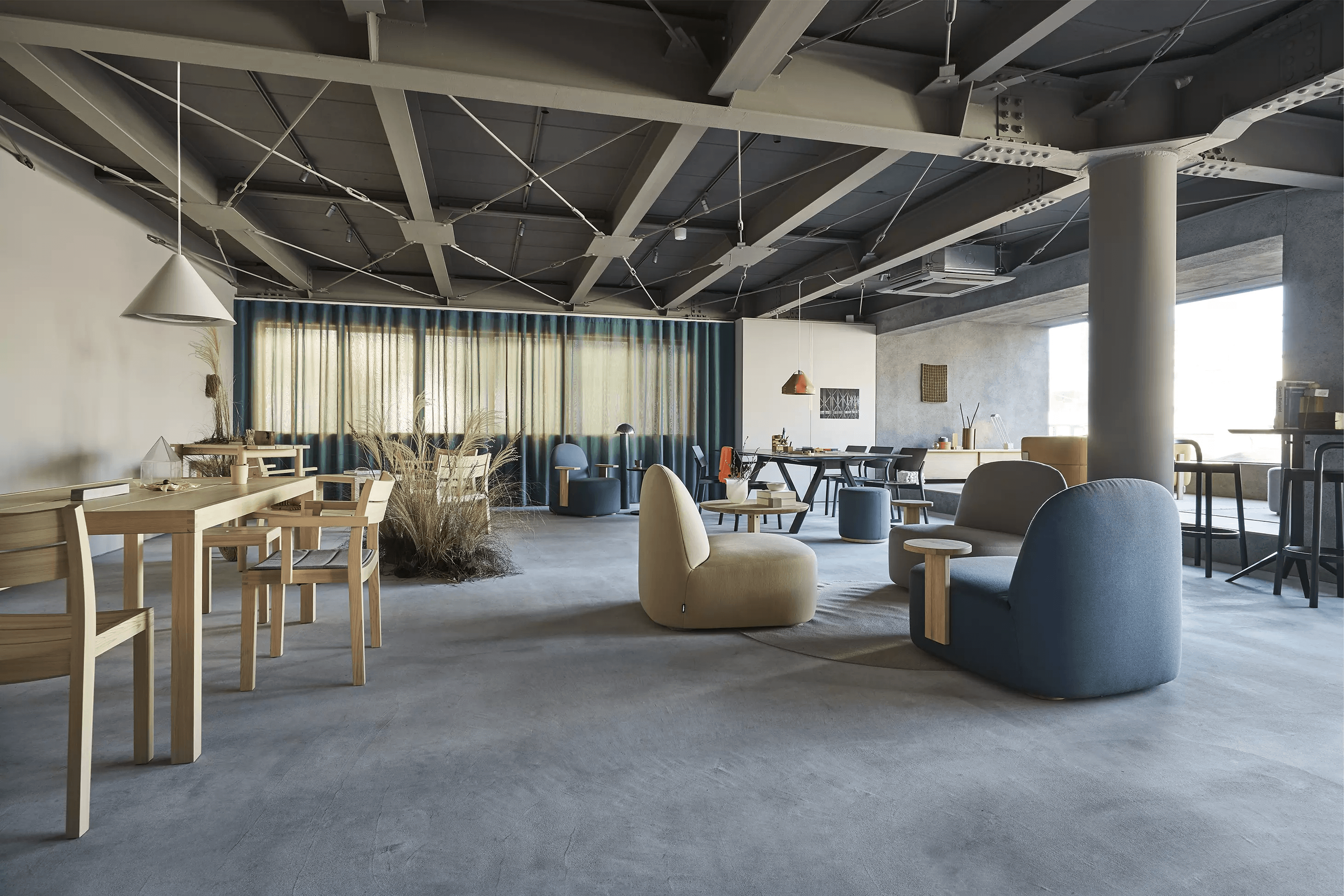
Based on a request to design the space so that it could be used for various purposes, I’ve aimed to create “pure” space free from affection by the colors of other items and selected gray for the entire tone. To embody the image of a neutral, “white box” for the exhibition space, I’ve used gray. The client seemed to worry if the color might be disturbing. Partly thanks to the light coming from the big opening, which doubles as an approach, however, many visitors reportedly have recognized the color as white, and this is exactly what I’ve intended to ensure. As a result, this job has become a breakthrough for me.
A space that provides comfort and something to learn
I consider architecture and interior design to be technologies to provide a “spatial experience.” A nicely designed space allows light to filter in beautifully, which makes the furniture there look even better. And what is indispensable for the “spatial experience” is a moderate sense of tension. In my opinion, such a moderate sense of tension provides not only mere comfort but also something to learn, and the space itself contains some elements that make visitors feel that it represents an ideal model that they should follow.
Accordingly, my key approach is to reduce “noise.” For example, even if you stay at an luxurious hot spring hotel, your travel would be ruined if the hotel has such a noisy interior that you cannot feel relaxed or unwind yourself.
At Karimoku Commons Tokyo/ photo©︎ Tatsuya Watanabe
Perspective to see the entire environment changes space design
Another important thing is to think from the perspective of seeing the entire environment.
The “environment” here is slightly different from the so-called natural environment or exterior space in architecture.I began to think that way when I worked with Mr. Peter Stutchbury, an Australian architect, on a project in Japan, “Wall House” (2009), for about two and a half years.
While working on the project, I went around Peter's architectural works together with him and had many good discussions. This experience has helped me realize that the word “environment” refers to all spaces around us, such as the architecture, interior, and exterior. In a sketch by Peter, for example, I couldn’t tell which part was inside the room and which part was outside. Now I understand that the sketch showed his attitude of trying to create not only an architectural work but also, so to speak, the entire “environment.”
Wall color serves as the coordinator of the indoor environment
Peter's sketch has taught me that the interior is also one of the important components of the “environment.” In this case, the key lies in the wall color. Since the wall color considerably affects the atmosphere of the room, I don’t decide the wall color first.
I first consider what color is suitable to match the surroundings, and this process results in the decision of the color of the wall. I often select gray, but this is just the result of such a consideration.
I believe that the wall color plays an important role as the coordinator to ensure a beautiful harmony between a wide variety of components of the interior space, such as the furniture and floor. Therefore, “painting” is the best solution because it provides flexible color options for the wall color to fulfill that role.
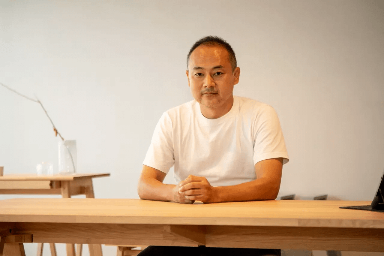
(Portrait shooting: Tatsuya Watanabe)