SHARE


Using memory as a color database
Every time I use paint, I ask the manufacturer to make five to six samples for the color of my interest. I select specific colors in consideration of how they would be used at the site and how well they would match other materials. With that said, I can’t say for sure if they will work until I am finished, to be honest. Lately, I sometimes select a color while tracing my memory and asking the manufacturer to “make it brighter than that wall,” “make it a little darker” or “change the nuance slightly.” In a sense, I use my memory as a color database.
Color selected after checking it in morning sunlight
The wall color is a critical element that eventually determines the quality of the space, so it takes rounds of trial and error each time.
Therefore, in any project, I make decisions after checking the relevant color in morning sunlight at the same time of the day. I always do so in the morning because I need to check the color using similar light that has as much hue balance as possible. If checked at a different time, even the same color would look different, so I’d like to avoid this. If wanting a “color midway between this color and that color,” I always ask the manufacturer to mix colors beforehand so that I can order the same paint, rather than asking on-site painters to do so. This is because, if mixed by on-site painters on the spot, the resulting color is ad hoc. This means that if partial repair is needed later, the same color cannot be reproduced.
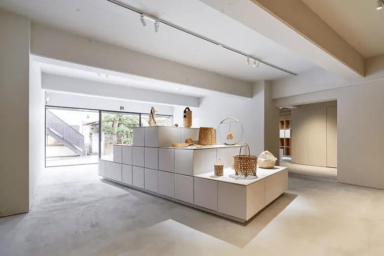
At Karimoku Commons Tokyo/ photo©︎ Tatsuya Watanabe
“Honest design” as the key
Since the beginning of my career as an Architect I have told myself that in order to create a good environment and space, I need to be “honest.” This idea underlies my belief that the wall color serves as the coordinator for various elements, such as the furniture and floor. In this case, I need to be honest not with myself, but with what it should be, which I always pursue. To create an environment, I believe that it is important to pursue what it should be without sticking to my own ego. To do this, some kind of honesty is required. Rather, I cannot do anything else.
Painting determines the quality of space
To achieve an “honest design” or a space without “noise,” I have been saved by painting many times.
I don’t mean to deny wallpaper itself, but I feel nothing makes the space more boring than wallpaper chosen for negative reasons, such as process adjustments and cost adjustments. Moreover, seeing wallpaper peeling off due to aged deterioration makes me feel as if seeing “the wolf strip of his sheepskin”.
In that respect, the quality of a space finished with painting is strikingly different.
For example, if painted in the same color, even different parts can constitute a seamless, flat surface, with the details that you don’t want to show concealed.
I’ve designed Karimoku Commons Tokyo, a show space and office for a major furniture maker. In this project as well, painting assumes great significance. The door of the service elevator there has been painted in the same color as that used for the surrounding walls, thereby concealing the door so that the exhibition atmosphere is not disturbed. Meanwhile, in “ dotcom space Tokyo,” the same color has been painted for both the Interior wall and the wall facing the exterior in order to exude a sense of continuity in the space. What has made both cases possible is painting.
In addition, even if there is any problem, painting can be redone, making the client’s burden relatively small, and this is another advantage.
I think that I can no longer feel satisfied without painting.

Aiming to use color like material
I have an impression that color is similar to material.
For iron, for example, there was a time that I created iron furniture, so I got the feeling that I could understand something important, even if I’ve not mastered it.
When it comes to “color” seen as material, I’ve finally got the idea that “if I use the color this way, that space will be created that way.”
These days, however, it seems that the range of the colors that I use is narrowing down without me realizing it.
To remember my original resolution to be “honest,” I’m thinking of taking a step into a new field.
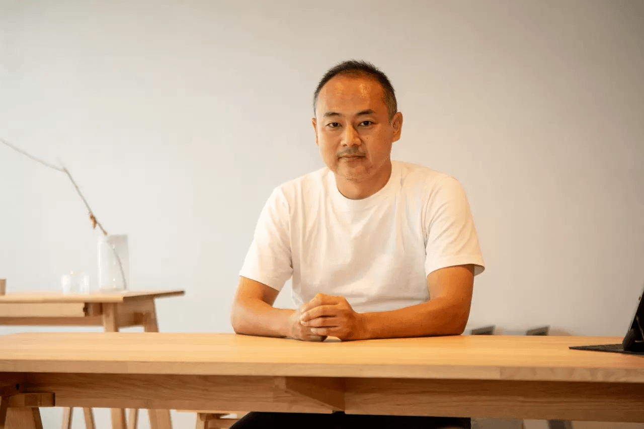
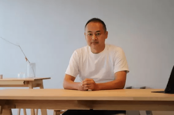
(Portrait shooting: Tatsuya Watanabe)